The Woods Arts & Wellness
Role: Senior Brand Leadership · Brand Strategy · Identity Direction
Scope: Brand Positioning · Brand System & Visual Identity · Logo · Tagline · Print · Digital · Signage & Environmental Graphics
Bringing clarity and warmth to a care-based wellness organization.
Strategic repositioning for clarity, credibility, and continuity of care

The Gap
The Woods had a strong mission and deep therapeutic expertise, but its external communication did not clearly convey its role as a provider of care.
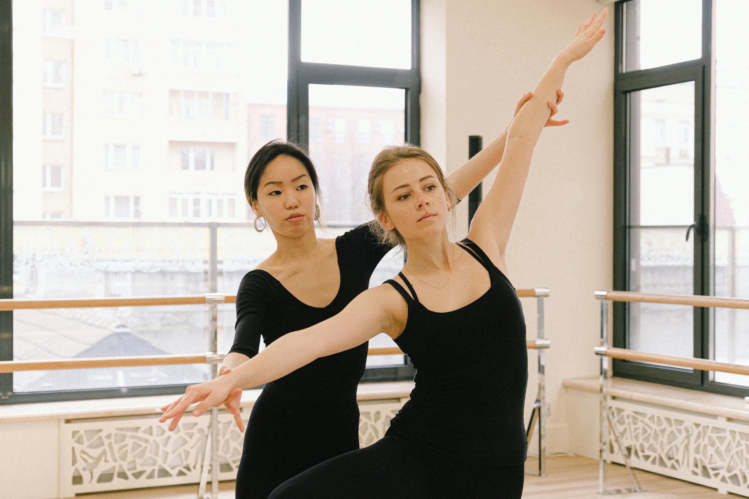
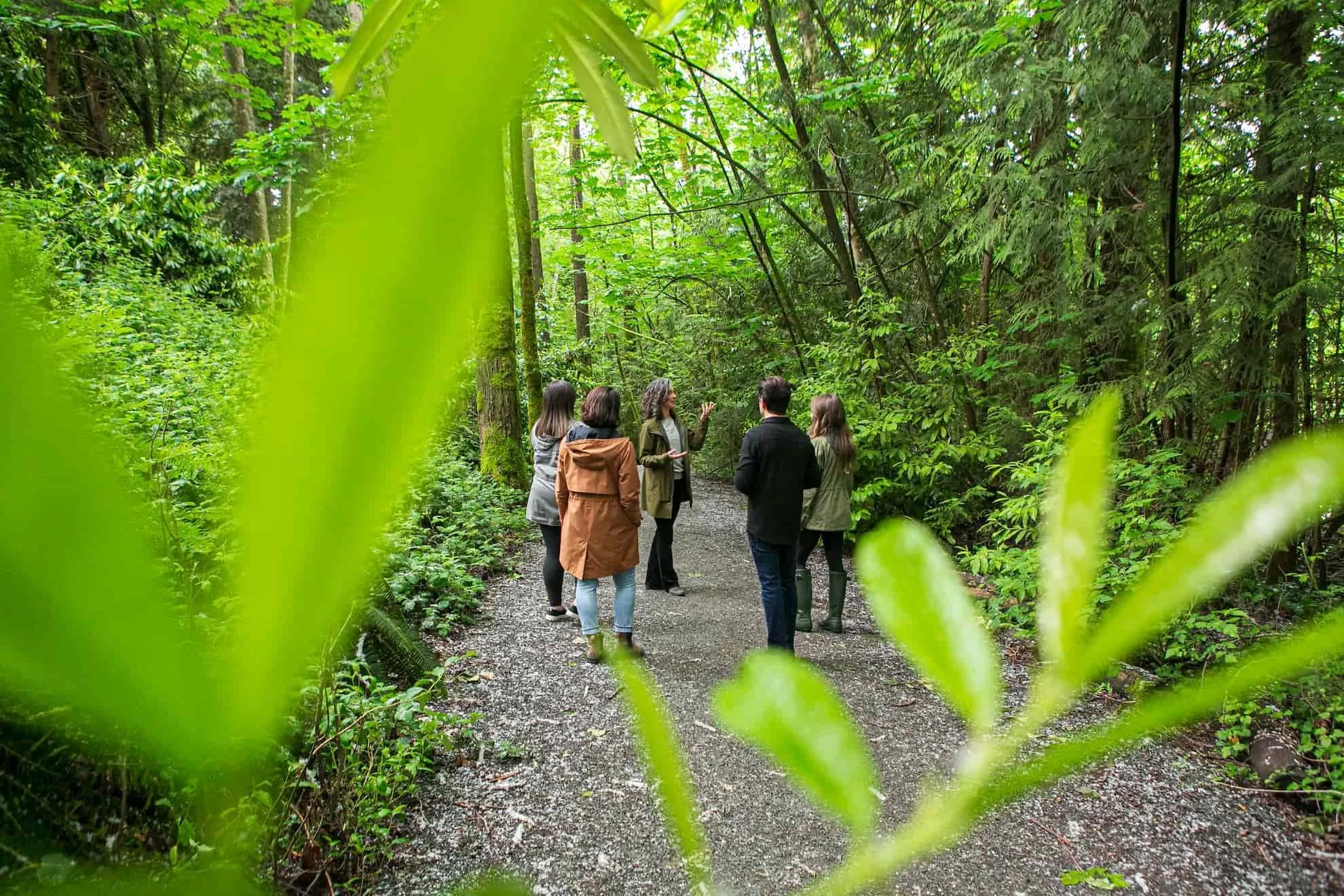
The integration of nature, art, movement, music, and therapy was central to the work — but it also made the organization difficult to understand quickly, especially for people actively seeking therapeutic support.
The care was clear in practice. The brand needed to make it easier to recognize, understand, and trust.

The Shift
Before
Unclear care positioning and category ambiguity
Difficulty understanding who services were for and when they were appropriate
Brand lacked authority as a therapy provider
Art, music, movement, and nature risked being read as activities rather than therapeutic modalities
Inconsistent expression across communications and environments
After
Clearly positioned as a wellness and therapy centre
Care-led language calibrated to individuals seeking trauma-informed support
PERMA model articulated as a structured, evidence-based framework for wellbeing
Visual and verbal system grounded in calm, safety, presence, and emotional regulation
Unified expression across clinical, informational, and environmental touchpoints


The Work
I worked closely with founder and Executive Director Elise Girardin, MA, MCP-AT, RCC, to translate The Woods’ purpose into a clearer care-led narrative.
While The Woods delivers therapy through art, movement, music, and nature, the primary offering is care. The strategic work positioned therapeutic intent — not medium — as the organizing principle of the brand.
Anchoring the system in the PERMA model created a stable, evidence-based structure for explaining wellbeing in clear and credible terms.


Positioning and Messaging
The brand language was reframed around wellbeing, safety, therapeutic support, and continuity of care. This helped prospective clients understand what The Woods offers, who it supports, and why the approach can be trusted.

Brand Applications
The system was designed to work across clinical, educational, outreach, digital, print, and environmental contexts — creating a more consistent and reassuring experience wherever people encountered the brand.

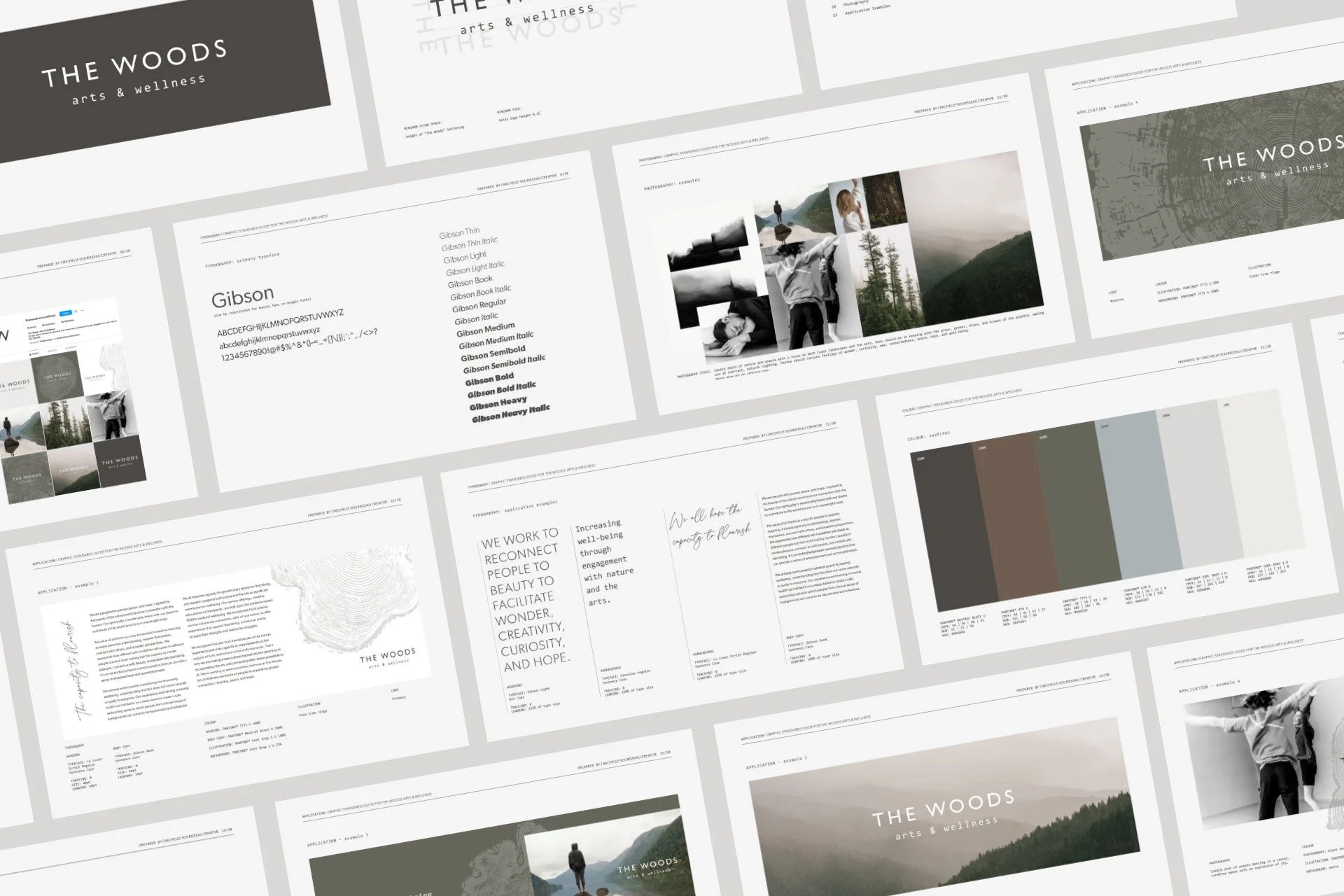
Visual Identity System
Imagery, colour, typography, and supporting design elements were guided by the same care values: calm, grounding, emotional presence, and connection to nature. The system balanced warmth with restraint so the brand felt expressive without becoming unclear.
The Result
The Woods Arts & Wellness now presents as the care-based wellness and therapy centre it had become in practice.
The brand helps people seeking support understand The Woods’ role more quickly and confidently, while giving the organization a steadier framework for communicating as services evolve.
The brand now functions as an extension of care itself — creating reassurance, clarity, and trust rather than simply promoting the organization.

Selected collaborators: writing (Wendy Lees), photography (Claudette Carracedo)