BC Rent Bank
Role: Senior Brand Leadership · Brand Strategy · Brand Direction
Scope: Brand Positioning · Brand System & Visual Identity · Logo · Website Strategy & Design
Making a province-wide housing support organization clearer and easier to trust.
Strategic repositioning from pilot initiative to trusted backbone organization

The Gap
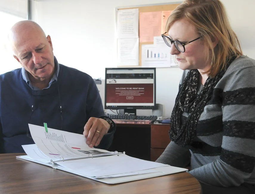
BC Rent Bank had grown from a pilot initiative into a critical support system for British Columbia’s provincial rent bank network.
But the brand still felt cold, institutional, and transactional — creating distance between the organization’s purpose and how it was experienced by the people who needed support.
Internally, partners understood BC Rent Bank as a compassionate, practical resource helping people stay housed. Externally, the brand had not caught up.
The Shift
Before
Positioned as a temporary or pilot initiative
Perceived as cold, institutional, and rule-driven
Inconsistent messaging and visual standards
Barriers to access for vulnerable audiences
Communications that felt more financial than human

After
Positioned as a trusted backbone organization
Perceived as a welcoming, supportive resource
Clearer messaging and visual standards
Improved accessibility across touchpoints
Communications grounded in dignity, clarity, and care

The Work
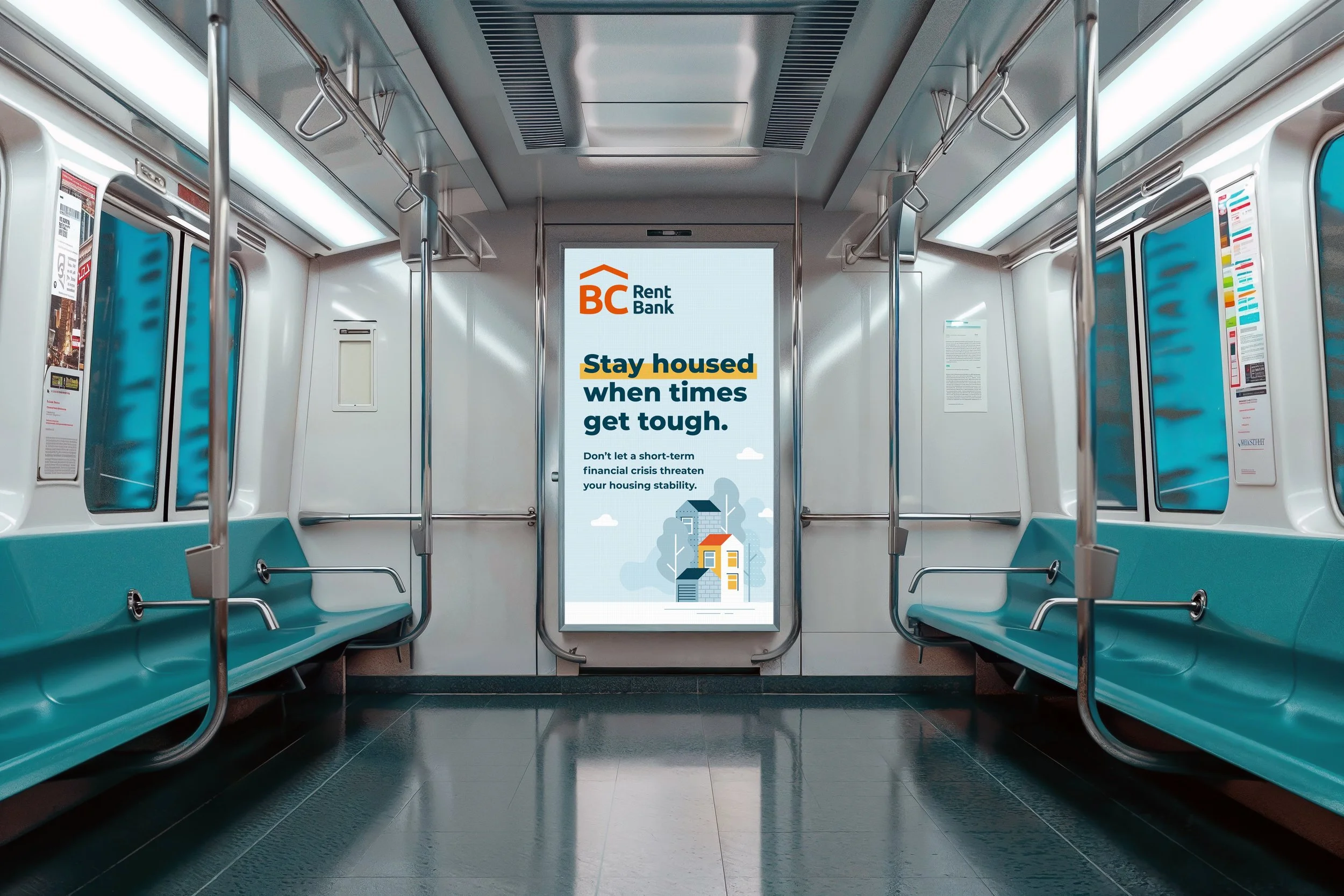
I led a strategic reframing of BC Rent Bank’s role, anchored in the idea of offering a ray of hope during moments of financial crisis.
That idea shifted the brand from a transactional source of emergency funds to a trusted support system grounded in dignity, clarity, and empathy.
The work balanced warmth with accessibility — ensuring the brand could feel human and supportive while remaining clear, practical, and easy to use.

Website strategy
The website moved from a content-heavy, difficult-to-navigate structure to a clearer experience organized around user needs and decision pathways. Plain-language steps, clearer calls to action, and accessibility-informed design reduced friction for renters seeking help.
Accessibility & Communication
Accessibility was treated as a strategic principle, not a compliance exercise. The brand system reduced barriers through clearer language, stronger hierarchy, more approachable visuals, and more intentional content structure.


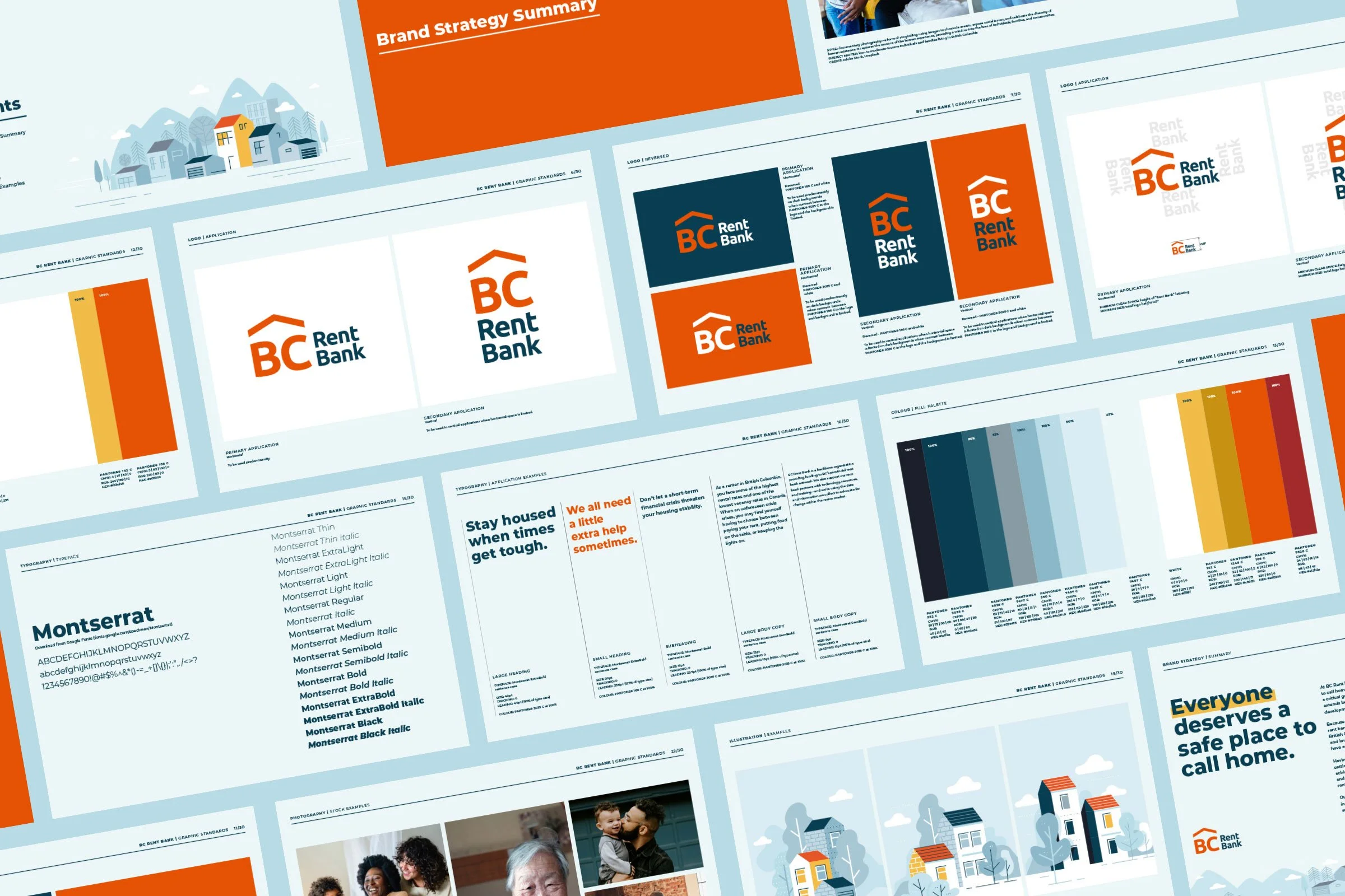
Visual Identity System
The visual system moved away from a cool, institutional tone toward a warmer and more hopeful expression. Photography, illustration, colour, and language were refined to reflect the diversity and lived experience of the communities served.
The Result
BC Rent Bank now presents as the trusted, human-centered support system it had become in practice.
The brand helps renters, partners, and community organizations understand the role of BC Rent Bank more quickly and confidently — while supporting more consistent communication across a province-wide network.
The quality of the brand now better reflects the care, clarity, and practical support behind the service.
“Talking with Michelle and her team, and seeing how they interpreted our story, values, and mission in new ways, was genuinely exciting. The work brought clarity and warmth to how we show up for the people we serve.”
- Melissa Giles, Managing Director, BC Rent Bank

Selected collaborators: website development (Jeremy Lind); writing (Wendy Lees)